Step 7: Create a line
chart: Watch
Video Instructions
To create a line chart
similar to the chart you saw on the internet:
·
Create
the basic chart:
o
Highlight
from 18-29 to the last number for 65+, but don’t include the maximum row. This is
what will be in your chart, plus the label for each of the lines. Choose insert
/ chart and choose the line chart and then pick the first one.
·
Get
the x axis labels of the dates from column 1 :
o
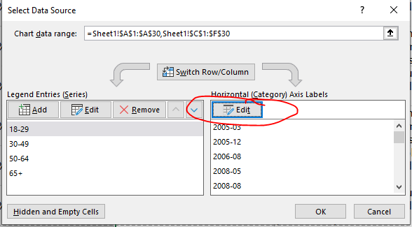
Right
click on the area of the chart with the lines and choose “select data”
o
Click
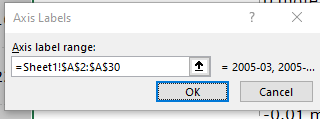
“edit” on the horizontal category and then select all the dates and press OK 2
times:
Add titles to chart, horizontal axis and
vertical axis:
·
Click
on the chart and then on chart design
·
Then
down arrow on “add chart element” icon 
·
Then
choose axis title and choose both horizontal and vertical. If you did not have
a chart title box, choose chart title
Now that you have boxes for
each title Then change your titles:
·
Horizontal:
Survey dates
·
Vertical
: % of people using social media
·
Chart
title: American's use of Social Media Surveys by Pew Research (n varies)
Push the chart down below the
list:
·
Be
sure to grab the full chart, not just the inside box
·
If
you move the wrong part, you can put it back with ctrl z
Step Extra: You
can watch this video about using a pivot table to further analyze this data.
You don’t have to do what it says, but having an introduction to pivot tables
may help you in the graph analysis you will do later.